Painted Pages Web Design

Distinctive user experiences and remarkably happy clients

  • Welcome
  • Who We Are
  • What We Do
  • Portfolio
  • Blog
  • Happy Clients
  • Contact Us

WordPress vs. Squarespace – How do I choose?

August 16, 2018 By judith Leave a Comment

These days I develop websites using either WordPress or Squarespace. When I started out 18 years ago, I hand coded sites in HTML, then added CSS when it became widely supported, eventually moving on to Dreamweaver, a WYSIWYG website builder, while continuing to dig into the code. Well, that’s ancient history.

So here we are in 2018. For me, for my clients, it comes down to WordPress and Squarespace. Both have the capability to help us create beautiful, functional websites.   And while both are great, each has its own strengths and weaknesses.

How to choose? Let’s break it down…

Flexibility

The real power of of WordPress is its extensibility, ranging from simple social sharing icons to robust membership site plugins to e-commerce themes and tools.. We can create almost any kind of website you desire. WordPress is an open source platform – it’s free and open to everyone to not only use, but to customize. Developers and programmers create tools such as templates (themes that control the visual appearance of your site) and plugins (code that adds specific features / functionality to a website).  If you can dream it, you can find it. Sounds hard to beat.

However, it can be a double edged sword since it’s impossible to police the quality of all the tools created. And the better ones are often not free. It takes time to cull through everything, and there isn’t always support available when you need it.

Squarespace has less flexibility because the software is not open source like that of WordPress. But everything is closely controlled, monitored and tested to ensure they work 100% of the time. So that means less breaking, hacking, frustration.

So while WordPress has more flexibility than Squarespace hands down, there is a downside.

Ease of Use

The WordPress learning curve is steeper than that of of Squarespace. If you want to update and manage your own site once it’s launched, Squarespace is going to be easier (and more fun). The Squarespace editor is WYSIWYG (What You See Is What You Get) . Make changes, see the results in action.

Support

Because WordPress has such a large community of developers, so many plugins etc, there can be information overload.   And it is often difficult to find relevant, decent help.

Squarespace has great email support, 24/7. They also have excellent tutorials.

Ongoing maintenance

While WordPress is more powerful, there is a great deal of maintenance required to keep a WordPress website in good shape through all the many updates of not only the platform itself, but also the themes and plugins.

Squarespace, being a closed environment, controls all aspects of the platform and manages all the updates.

Pricing

A wordpress site will cost more than a squarespace site to develop, often as much as 2 – 3 x more. It’s just far more time consuming and complex.

Summing up…

For most of my clients, Squarespace is now the platform of choice. It has beautiful, polished themes, tested and quality controlled, and 24/7 help.

However, if you want or need a very sophisticated website with particular functionality that is not available or is quite limited on Squarespace, WordPress is recommended. And in terms of e-commerce sites, Squarespace has some limitations (for example the number of products you can sell), while WordPress has countless themes, tools and no limits on products.

Heidegger called it unusability – 5 ways your website is driving people away

July 29, 2017 By judith Leave a Comment

heidhammer.5Website design and user experience have much to learn from philosopher’s Martin Heidegger’s thinking. The idea that people interact with objects in order to accomplish certain goals comes directly from Heidegger, who also held that this tendency to fixate on future goals results in a state of being ahead of ourselves.
 Heidegger calls the act of dealing with an object’s shortcomings “coping.”

“We discover [an object’s] unusability…not by looking at it and establishing its properties, but rather by the circumspection of the dealings in which we use it.” ─ Heidegger

Users don’t have the time or desire to simply “cope” with your website.  What makes a site unusable?  Here are 5 characteristics:

  1. Page Overwhelm

    Effective websites keep the visual options to a minimum.  If you have more than 3 major pieces of information or options on a page, you’re likely overdoing it. For example, focus on the 3 BIG benefits you can deliver.  Think of what you help people get more of, or get less of.

  2. Websites that do not adapt to their viewing environments (in particular smartphones)

    Your website may look great on your computer, but have you checked it on a variety of devices and in all the major browsers? When you do, you may be in for a shock. It’s imperative to make sure your site is responsive. If not, the majority of users will bounce right off – most notably because the majority of users are now viewing your site on their smartphones.

  3. Rotating Banners

    Are rotating banners appealing? They used to be. Are they effective – a definitive NO. In fact, after the first banner, users rarely click additional images – they don’t have enough time to read the banners and they get frustrated when they can’t control what they’re looking at.

  4. A lack of social media links -> an inability to interact, to have a conversation

    Social media has emerged as one of the most important marketing platforms in recent years (like it or not!). If you want to be progressive, current and open to embracing new ideas, it’s critical to include social media links on your site. Moreover, social media is a quick way to demonstrate to your visitors that your business is active and interactive.

  5. Slow site speeds

    If a page doesn’t load in 2 seconds, there’s a greater probability of site abandonment. What to do:

    • Don’t upload overly large images
    • Create clean, semantic, standardized code and optimize it for performance
    • Use a reliable, quality web host. If you’re using wordpress, make sure your hosting company has “managed wordpress hosting” – it REALLY makes a difference.

What is responsive design and why does it matter? Hint: the ubiquitous smartphone

May 5, 2017 By judith Leave a Comment

Because I was in complete agreement with myself, for the most part, this project – the redesign of my own website – only took a few weeks from concept to launch.  And because I’m a nerd at heart (although my son recently told me that I’m a nerd on the surface too which I consider a compliment) I’ve been playing with it on various devices, watching it adjust to my behavior and its environment with enviable fluidity. It’s called responsive design and it’s important because of the ubiquitous smartphone (1) and google’s most recent search algorithm update (2) which mightily favors responsive websites over those that are not.

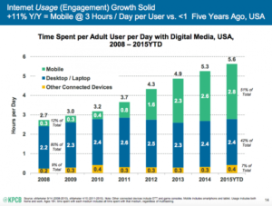
Mobile  Media Time Is Now Greater Than Desktop and Other Media (as of July 2015)

‘The latest data shows that we are now well past the tipping point … Mobile digital media time in the US is now significantly higher at 51% compared to desktop (42%).’

Here’s a chart:

Mobile friendly web design Westchester NY

What they’re saying is this:

‘The implications are clear – if you’re not able to reach your audience through mobile search or display, or you’re not providing a satisfactory mobile experience you will miss out compared to competitors who are.’

─ Mobile Marketing Statistics 2015

A Bit of History

Ethan Marcotte wrote an introductory article about this approach in 2010 for A List Apart. It stems from the notion of responsive architectural design, whereby a room or space automatically adjusts to the number and flow of people within it:

“Recently, an emergent discipline called “responsive architecture” has begun asking how physical spaces can respond to the presence of people passing through them. Through a combination of embedded robotics and tensile materials, architects are experimenting with art installations and wall structures that bend, flex, and expand as crowds approach them. Motion sensors can be paired with climate control systems to adjust a room’s temperature and ambient lighting as it fills with people. Companies have already produced “smart glass technology” that can automatically become opaque when a room’s occupants reach a certain density threshold, giving them an additional layer of privacy.”

─ A List Apart

And while this concept is still, in large part,  futuristic for architecture, it is present-tense for web architecture.

5 things I need to know before designing your website

February 19, 2017 By judith Leave a Comment

Web design and development Westchester NYWhen I begin work with a new client, I am on a fact-finding mission, gathering information so that I can appropriately scope the project, give a viable quote and avoid “scope creep” and post-development fixes.  Of course, my ultimate goal is happy clients.

I always ask these 5 questions at our first meeting:

  1. Why do you want a website?   In other words, what benefits will be achieved by having a website – what is the key objective?
  2. What is the mood you would like your website to convey? When visitors view your site (and social media) what do you want them to think / feel about you? Please list 3 or more adjectives.
  3. Who are you competitors?  What sets you apart from your competition? What do you value? What’s the emphasis?
  4. Who is your prospective audience?  Age, gender, computer saviness, etc.?
  5. Show me 3 websites whose design you like.  What do you like about them?  Show me 3 you dislike.  Why don’t you like them?

While there are at least 95 (or 950) questions – in both directions – that will follow as we work together, the answers to these  5 primal questions form a solid base on which to build.

5 significant indications your website will profit (markedly) from a redesign

November 21, 2016 By judith Leave a Comment

Website standards, from both a design and technology standpoint, have evolved significantly in the past few years. Outdated websites can cost you potential clients. As a general rule, it’s a good idea to revamp at least the look of your website every 3 years, and the functionality every 5 years. Considerations include:

Outdated Look

Visual design has a significant impact on a visitor’s emotional response to your business – sites older than 3-5 years look outdated and unprofessional. An attractive, up to date design is a critical ingredient of your message.

Current design trends include a minimalistic approach and spacious, clean page layouts with lots of white space.  Outdated design features include photo carousels, stock photography, clutter (unnecessary, irrelevant elements crowding the page), massive hero images which push down key content, animated gifs, flash intros and more.

Dated Technologies

In this day of mobile technology, it is astonishing how many companies and organizations have sites that are not responsive. The most important technological reason to update your website is to make it responsive, i.e. mobile friendly. If your site doesn’t adapt to its environment, it’s time for a redesign. Read more about responsive design and why it matters

In addition to responsive design, other important trends include ease of updates and maintenance using a Content Management System (CMS) such as WordPress, social media integration and use of video.

Web-ready Content

Effective web content is simple, on target and easy to find. Content must not only be relevant and up to date, it must be written specifically for the web.  Content strategy includes research, writing and editing for your human visitors first and foremost and, as an added bonus, valuable, web-friendly, fresh content gets noticed by the search engines.

Great content is not enough, however – it must be presented in an engaging, visually compelling manner on each and every page.  Use of font, color, contrast, white space, headings, short paragraphs, bulleted lists, page layouts and more are critical elements in content strategy.

Search Engine Optimization (SEO)

If your site is not coming up in the search engines, the cause is more than likely an outdated approach. A redesign will correct these flaws. In particular, the creation of a responsive design is a major component in determining SEO rankings – google’s most recent algorithm rewards responsive websites, while those that are not drop precipitously in search results.

SEO is not trickery – don’t buy the snake oil!  Instead, the consistent use of sound and effective techniques over time will be rewarded – it’s about well presented, valuable content. If you are using WordPress, the use of a plugin such as All In One SEO or Yoast will aid in boosting your search engine rankings. Another very important component of SEO is social media integration – your social media accounts should be set up to work synergistically with your website to help you get noticed.

A Compelling, Engaging and Logical User Friendly Experience

If your site is too confusing and visitors can’t find what they are looking for, you will lose them. If your site is not compelling, you will also lose them.  The goals of a redesign must include intuitive navigation, streamlined browsing and well-organized content presented in an engaging manner. Considerations include:

  • “Flows” – the desired paths we want our visitors to travel in our sites leading to specific actions, whether making a phone call, acquiring knowledge or making a purchase.
  • Storytelling – create compelling user experiences by telling stories- be personal, specific, unique, idiosyncratic, yourself.
  • Website visitors don’t read, they scan.  Create scannable content by using headings, white space, contrast and other assets strategically.
  • Initiate a dialogue with visitors, involve them in discussions and gain their trust by addressing their needs and speaking with them honestly and directly.

Marketing à la Hubspot – it’s like dating

September 8, 2016 By judith Leave a Comment

Responsive Website Design Westchester NY‘Attract.  Engage.  Delight.’

It’s called inbound marketing and the principles are simple, intuitive, and as conceived and executed by Hubspot, notably game-changing.   Spawned at MIT in 2006, with a cool west coast vibe, Hubspot is a company and a software product, it’s both.  The central takeaway is ‘publish your way in’.  Not with blanket email campaigns, ads, or phone calls – that’s ‘outbound’, an annoyance and ignored for the most part.

Instead:

  1. Attract. Publish compelling content – write, educate, be of service.  Your vehicles include your website, blog, video and social media.
  2. Engage. Listen very carefully to your prospective clients.  This is key.  What is the problem that needs to be solved? Think, be creative, have a dialogue.
  3. Delight.  Offer a solution.  One size does not fit all – cater to your clients’ needs and desires now that you know what they are.
  4. Everybody’s happy.  You have happy clients and happiness is contagious.

There are nuts and bolts, of course, powerful online tools for content management, web analytics, SEO and more –  all fodder for another blog post.  But this is not about that, it’s about Hubspot’s philosophy – valuable content, a targeted approach, a personalized solution.


Taking a little break

Website design Westchester NY

Follow Us

  • Facebook
  • Instagram
  • LinkedIn
  • Twitter

Recent Posts

  • WordPress vs. Squarespace – How do I choose?
  • Heidegger called it unusability – 5 ways your website is driving people away
  • What is responsive design and why does it matter? Hint: the ubiquitous smartphone
  • 5 things I need to know before designing your website
  • 5 significant indications your website will profit (markedly) from a redesign

Copyright © 2022 Painted Pages Web Design, Larchmont, NY & Greenwich, CT

paintedpageswebdesign@gmail.com | 914.525.1184